Advanced Section – From Data Observation to Trend Judgment
This chapter teaches investors how to integrate "on-chain signals" into an actionable trend judgment system. From capital flow rhythms and social heat to user behavior, it builds an on-chain investment rhythm suitable for ordinary users.
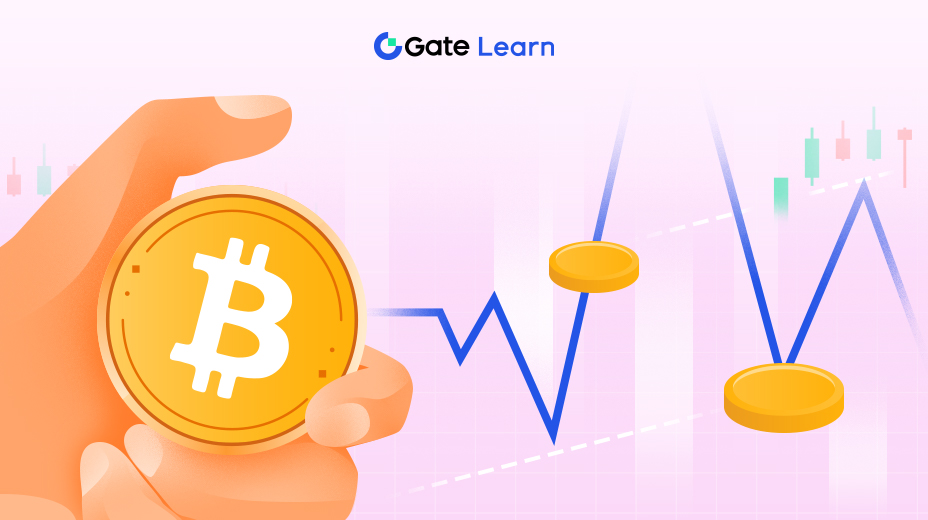
Why Is the Price Chart the Entry Point for On-Chain Signals?
Price is the ultimate aggregation of all information, but simply looking at price often cannot answer:
- Who is driving the market?
- Is capital flowing in or out?
- Is the current volatility genuine?
- Is the price movement a trend reversal or an emotional impulse?
On-chain data does not replace price but provides context and explanation for it. Therefore, investors must first master how to read price charts before layering on-chain indicators to form a systematic judgment.
Three Core Logics for Reading Price Charts
This section focuses on “visual reading methods” rather than piling up technical indicators. We focus on the three types of charts with the highest information density: candlesticks, volume, and depth/liquidity distribution charts.
1. Structure: Visual Judgment of Trend and Rhythm
Trend is not judged by moving averages but read from the rhythm of the structure—highs and lows (Higher Highs/Higher Lows vs. Lower Highs/Lower Lows).
Common misconception: Many users see a large bullish candle and think the price is about to “reverse.”
Correct approach: Observe the continuous high and low point structure.
Example:
If an L2 token forms the following structure within 48 hours:
- Highs: 3.1 → 3.3 → 3.28 → 3.45
- Lows: 2.75 → 2.90 → 3.05
You can immediately judge:
- Higher highs
- Synchronized higher lows
This is a stable upward trend structure, not an emotional pump.
Because on-chain data tells investors:
- Whether capital is entering following the trend
- Whether the main force is pushing the price up in the trend
- Whether accumulation vs. distribution behavior is consistent
If the price structure is healthy but on-chain inflows decrease, the upward momentum may be insufficient. If both structure and on-chain capital inflows are healthy, the upward move is more credible.
2. Liquidity: Where Are the “Checkpoints” in Hot Markets?
Many users are misled by a “price breakout,” thinking it indicates strength. In reality, whether a breakout is valid depends on liquidity resistance zones. How to identify liquidity-dense areas from charts? Using two common visualization tools:
- Volume Profile
- Order Book Heatmap
Example:
A project’s token price moves from 2.2 to 2.6, but investors see on the heatmap:
- Extremely dense order placements between 2.7–2.75
- Historical volume also concentrated in this area (large trapped positions)
Visual judgment:
This is not an “imminent breakout” but an approaching liquidity wall.
On-chain further verifies:
- Many old wallets near 2.7 waiting to break even
- No continuous inflow of new funds
You can pre-judge: the rise may be blocked rather than pushing higher.
3. Behavior: Identifying “Who Is Pushing the Price” from Charts
Price alone does not reveal participants, but visual charts provide clues: Big order-driven vs. retail-driven moves.
From chart patterns, it’s easy to judge:
- If price rises rapidly with very low volume → usually driven by large aggressive orders
- If price climbs slowly with continuous small trades → usually driven by retail consensus
Example:
Suppose BTC moves from 96,800 to 97,500 in one night:
- Candlestick shows a “single straight pull”
- Volume surges
- Tick-by-tick data shows large orders continuously filling
On-chain further verifies:
- Large capital inflows into CEX main wallets
- Perpetual contract open interest increases synchronously
Visual + on-chain data tells investors: this is not retail FOMO but a main force push.
Visual Example Demonstration
Here we simulate a common scenario showing how to combine readings:
Scenario: A new narrative token X surges 12% in a short time.
From the charts you see:
- Structure: complete high and low points, not a single spike
- Volume: increasing with a stepped pattern (common structure for sustained main force entry)
- Heatmap: huge liquidity wall between 1.82–1.85 above
- 1h buy/sell ratio: buy orders far exceed sell orders
- Depth chart: support orders below are twice the resistance orders above
On-chain further verifies:
- Real-time inflows > outflows
- Whale wallets are not heavily distributing
- No extreme high-leverage longs in the contract market
Comprehensive judgment:
- Strong mid-short term trend
- Likely to face resistance at 1.82–1.85
- Not suitable for blind chasing, but good to wait for a pullback to observe buy strength
- If the liquidity wall is absorbed, there is room for a second upward attack
This is the core value of this lesson: forming a complete judgment loop through “visual reading + on-chain verification.”
Summary
Starting from basic on-chain data, this course helps investors build a “visual understanding framework” accessible to ordinary users. Investors not only learn the meanings of core indicators such as price structure, capital flow, liquidity depth, and sentiment heat but also understand how these translate into intuitive signals on charts.
Through multiple tool examples, investors can:
- Understand whether capital is flowing in or out
- Identify fake heat, bot trading, and main force behavior
- Judge whether liquidity structure is safe
- Get early warnings from on-chain signals before risks emerge
The core goal of the course is not to turn investors into analysts but to equip them with independent market judgment skills: recognizing resonance signals during parabolic moves, judging panic levels during crashes; verifying data when chasing hot spots rather than relying on pure emotion. When others only see price, investors see the underlying structure; when the market is noisy, investors find the true rhythm from on-chain data.
May these methods become investors’ first reliable toolkit for entering the on-chain world.
Lesson 1:Getting Started: Why Pay Attention to On-Chain Signals
Lesson 2:Tools Section: Mainstream On-Chain Analysis and Visualization Tools
Lesson 3:Practical Guide: On-Chain Scanning Operation and Meme GO Tutorial
Lesson 4:Pattern Recognition of On-Chain Behavior: Understanding the True Intentions of Players and Funds
Lesson 5:Advanced Section – From Data Observation to Trend Judgment
Related Courses

Guide to Gate Dual Currency Products
Tools That Help You Trade Better: Moving Averages, Trend Lines, and Indicators

The Beginner's Guide to Blockchain-based Airdrops

Introduction to Meme Tokens

Learn about web3 data and analytics